• Happy Publication of "Star Spangled Banner" (1814)! 🚀💣🇺🇸

Link color bug/oversight in "Shades of Blue" theme.

Joined
Mar 21, 2015
Messages
525
Reaction score
105
Location
SW Wisconsin/Driftless
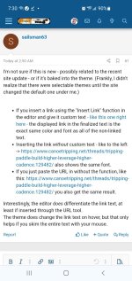
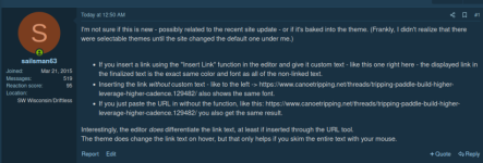
I'm not sure if this is new - possibly related to the recent site update - or if it's baked into the theme. (Frankly, I didn't realize that there were selectable themes until the site changed the default one under me.)

Interestingly, the editor does differentiate the link text, at least if inserted through the URL tool.
The theme does change the link text on hover, but that only helps if you skim the entire text with your mouse.
 
I'm not seeing what you're seeing: The main body of your message is black while the linked thread is blue in all 3 examples above. Did you switch from "Shades of Blue" for this post?

Were you viewing with the "Preview" option (I don't think the color change occurs when we're writing drafts but I'll look this afternoon when I do the TR). If not, "Preview" shows what your post will look like when posted. Personally, I construct the post and click "Preview" (upper right of text box) to proofread before posting.
 
Screenshot_20240817-073053_Chrome.jpg

I'm showing blue hyperlinks for all three. I regularly feequent another forum that utilizes Xenforo, and a few years ago they had an issue like you describe. It was blamed on one of the big browsers, I don't recall which. It only happened on the desktop site.

I have checked Chrome and Edge on my end, with different themes, and have not experienced the issue. Can you do a screen grab to show how it appears to you?
 
This is what I see:CTFScreenshot.png

I've tested in Firefox on linux mint, Brave on same, and mobile chrome on android. Same on all three. I've swapped between light and dark modes on the browser level to make sure that isn't affecting things. No change.

@Tryin' Your screenshot appears to be the default theme in light mode.

Did you switch from "Shades of Blue" for this post?
No, though I've swapped back and forth for testing. Based on how you phrased that, I do want to clarify: The theme is set on the viewer's side, not the poster's.
 
I'm not sure if this is new - possibly related to the recent site update - or if it's baked into the theme. (Frankly, I didn't realize that there were selectable themes until the site changed the default one under me.)

Sailsman, I see the same lack of contrast as you do between the inserted link text (the way you have done them) and the surrounding text in the Shades of Blue color theme—or color "style" in Xenforo's preferred terminology. Several observations about our color syles:

1. I appreciate that someone has noticed and even commented on our now seven different color styles because I have spent a lot of time implementing and tweaking them, and I'm not aware of any other Xenforo site that offers as many color styles as we do (although I'm sure some exist).

2. The site's increasing number of color style implementations has been announced HERE, HERE, HERE and HERE.

3. The only two color styles actually built into the Xenforo code by Xenforo itself—that is, the "default styles"— are now called Default Light and Default Dark. Default Dark was released last month by Xenforo and implemented four days ago on this site using the gear/crescent-moon/color-split-circle icon in the lower left corner of each page.

3. The five other color styles available via the Style Chooser paint brush icon, also in the lower left corner of each page, are all third-party add-on apps, which I have named: Arctic, Mocha, Shades of Blue, Shades of Grey, and Chestnut Green-Gray. They all have minor bugs and glitches in them. The most common glitch is a lack of contrast between regular text and linked text.

4. The lack of contrast glitch that Sailsman notices between regular and linked text in Shades of Blue is undoubtedly a bug in the third-party style app, which I can't fix unless I learn programming languages and which I'm not going to do.
 
5. To avoid contrast problems in any color style when posting links, DON'T POST NAKED OR RENAMED LINKS. Rather, use our UNFURLING LINKS feature, which is explained here:


. . . and here:


Rarely a day goes by when I don't edit posts to change naked links to unfurling links because I strongly prefer them for site appearance reasons. I'm in the SEO business here.
 
Similar issue with the Chestnut Green theme. It's always been that way,

If some writes "I have posted a video" and they bury the link in the word "video" it's difficult (for me) to see that the word video is actually a link.
 
Similar issue with the Chestnut Green theme. It's always been that way,

Yes, the third party developer of that theme and Shades of Blue, and perhaps others, apparently didn't test all the color variations against each other for satisfactory contrast and intensity. The Green developer did change her original green color theme at my request from something earlier called Minty Green, which I had initially implemented, to the style I now call Chestnut Green-Gray, but she's now dropped out of the color style business.

The most stable and least buggy color styles are definitely Xenforo's built-in Light Default and now Dark Default. However, the bugs I've seen in our five third-party color styles are all tolerable if you like the style. (I have other ghastly third-party styles I haven't implemented, but maybe I'll do so on Halloween for a day. I also have our old vBulletin theme.) Because I like dark themes, I've mainly used Shades of Grey for the past three years with no noticeable bugs. I like Dark Default better, so I've now switched to that.
 
Thanks Glenn, your reply is what I assumed and after reading your recent post about themes I understood that only the default themes are free of this (minor) issue. I made a brief switch to one of the default themes but I'm back using Chestnut Green as it is the most pleasing to MY eyes.
 
I made a brief switch to one of the default themes but I'm back using Chestnut Green as it is the most pleasing to MY eyes.

That's why I've implemented so many color styles. Don't let the perfect be the enemy of the visually pleasing. For your eyes only is not just a James Bond movie. Different cloaks for different folks.
 
Back
Top